
Your website was a masterpiece in the very latest of communication technology when it launched ten years ago, but how is it looking now?
In internet years, ten is Jurassic. And that wasn’t even the start, 20 years ago, there was already a World Wide Web of all manner of products and services. The very first websites were posted in the 1990s.
Technology has advanced massively in that time. There are form and function facilities which weren’t available just a few years ago, and their absence can make a site look and feel outdated.
Here is a quick health check for your website:
Symptoms of (p)age decay
Is your website showing any of these telltale signs of decrepitude?
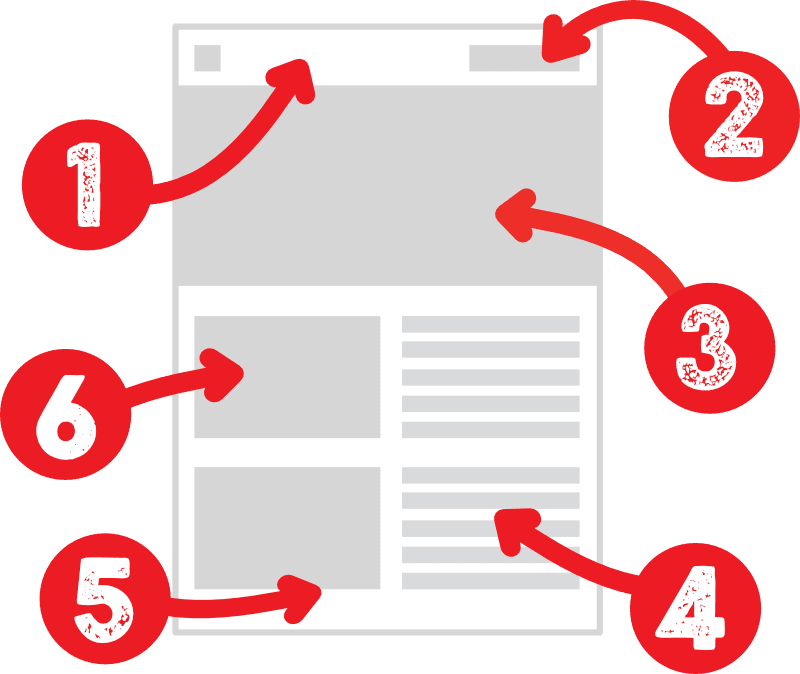
- Primary nav menu scrolls out of view
- Too many tabs, too many pages
- Page layout is not responsive
- Lack of local links
- Dull design
- Poor SEO and accessibility
Whether your old website needs a refurbishment, or a complete rebuild, these are the key areas we pay attention to:
Responsive design
Your website design needs to adapt to suit the screens of the various devices visitors use these days to access the web. Mobile phones are now the first choice of most people, so we think ‘mobile first’ when we are designing.
A responsive design is not simply about squeezing your content into smaller screens, it is about adapting to suit all user interfaces with fluid fonts, image sizing and layout.

- For example: Image sizes and justification can be set to adjust to different screen widths, and content can switch layout from horizontal to vertical as suits.
Easy navigation
The navigation in your website should be clear and simple. A golden rule of user interface design is that clicks are kept to a minimum. Your primary navigation menu should always be in view on both desktop and mobile devices.
All pages should have a back-to-top button. Posts in your blog should have next/previous navigation buttons and pages that have sequential content, likewise, rather than obliging visitors to click in and out of the primary navigation. Every superfluous click costs you visitors.
- For example: When you get to the end of this article, you have the primary navigation still in view, a back-to-top button if you want to read this again, next/previous links to adjacent posts and links to five related articles.
Structured content
We used to build our sites laterally, with separate pages side-by-side and a gallery of tabs in the navigation menu. Then mobile phones got smart.
Most visitors are scrolling, not clicking, and no one wants to be cycling back-and-forth to the nav menu hunting for the right content
Now we design our pages vertically and keep our primary navigation menu short and sweet. Most visitors are scrolling, not clicking, and no one wants to be cycling back-and-forth to the nav menu hunting for the right content.
- For example: For sites with modest content, put it all in a single page. For sites which need multiple pages, make the front page a comprehensive overview. Use local links in page content to take the reader to the next information they are likely to want – create a guided tour.
Rich design
Back in the day, website design was very limited and, typically, in the hands of the programmers. Now you don’t need to be a programmer to design a website, and so much more is available for a creative design. Websites now enjoy all the features of print magazine style with big, bold headlines, dropped caps, ‘standfirst’ styling on opening paragraphs, bullet lists, box-out stories and so much more…
For example: pullquotes look great and are super-easy to put in your posts – no coding needed
Accessibility
The content of your site needs to be presented in a fashion that makes it accessible to both your visitors and to search engines. Visitors need visually clear and well-structured content, and search engines need content compliant with WC3 protocols. Be aware that your visitors may be visually impaired or dyslexic and so use browser screen readers.

- For example: Google can’t see photos. To know what is in an image in our website, we have to tell it with words, or ‘metadata’, in the jargon. Putting a caption under the photo doesn’t help if you put it in the body of the article, it needs to be placed in a ‘field’ that Google recognises as a description of the contents of the image.
What’s possible
If you’re not immersed in the development of websites on a daily basis, then you’re unlikely to know what is possible. At Big Impact Design, we’ll have suggestions for features and functions to include in your website.


From dynamic footnotes to embedding YouTube videos but without the YouTube branding, animations, quizzes and, well – look around our website, and look at these demo designs showing what happens when our imagination runs wild…
- The Big Read – a broadsheet design for a content-rich site
 ‘The Big Read’ is a broadsheet magazine design built for a website with a lot of content presented in a magazine digest layout
 - Putting the ‘fun’ in functionality
 Communication is the name of the game but clarity and accessibility don’t have to come at the expense of fun. Talk to the robot…
 - Is your website a freak like mine?
 If you want a visually arresting and utterly unique website then you’re in the right place. Super Freak! is a stunner and looking for a home…
 - A perfect website design for event promotion
 Do you organise events? You need a website designed like this one to highlight your smart calendar
 - Punk snot dead…
 Music fans love the covers, sleeve notes and booklets that come with CD and vinyl records and we love designing them. Vinyl’s not dead and MP3s don’t come with gatefold inserts…
